
← Back to Work
The Brand
ETİ BİDOLU
Eti is one of Turkey’s most iconic food brands, with decades of heritage in biscuits, wafers, and confectionery. Bidolu is one of their flagship wafer products — a household name built on a simple but powerful recipe: layers of crispy wafer filled with real cream and peanut pieces. Despite its strong market presence, the original packaging had fallen behind the visual language of modern FMCG design.
The Old Design
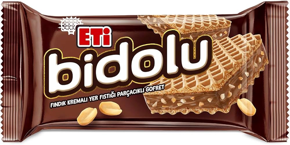
The original Bidolu packaging leaned on a deep brown, chocolate-heavy palette that blended into the category rather than standing out from it. The typography was conservative, the composition predictable, and the overall effect was one of familiarity without excitement — a brand coasting on recognition rather than earning attention.
The Design
From Safe
to Shelf-Stopping
to Shelf-Stopping
The name “Bidolu” is a play on the Turkish word “dolu” — meaning full, loaded, packed to the brim. It captures the essence of the product in a single word: whatever flavor you choose, you are getting something that doesn’t hold back.
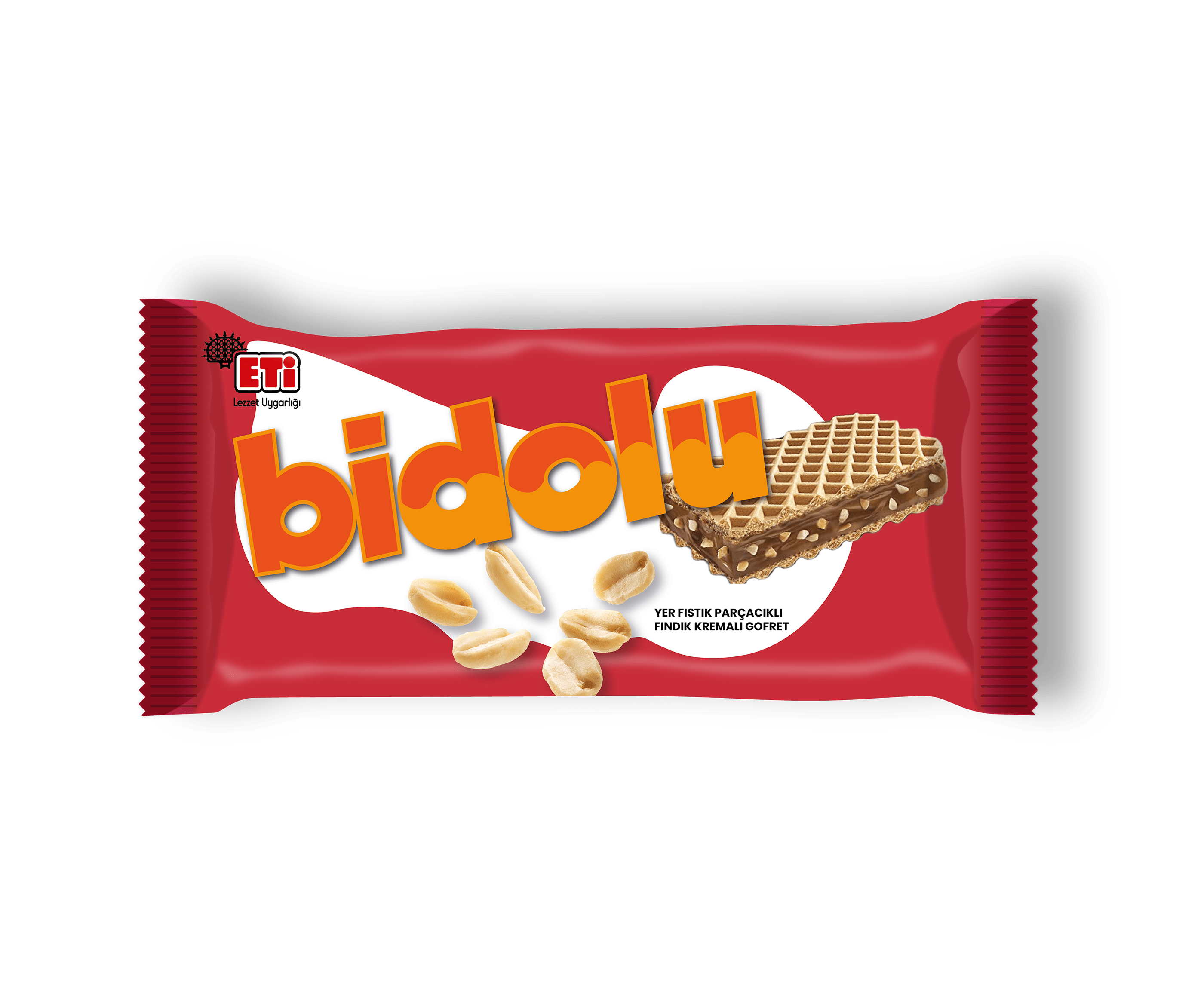
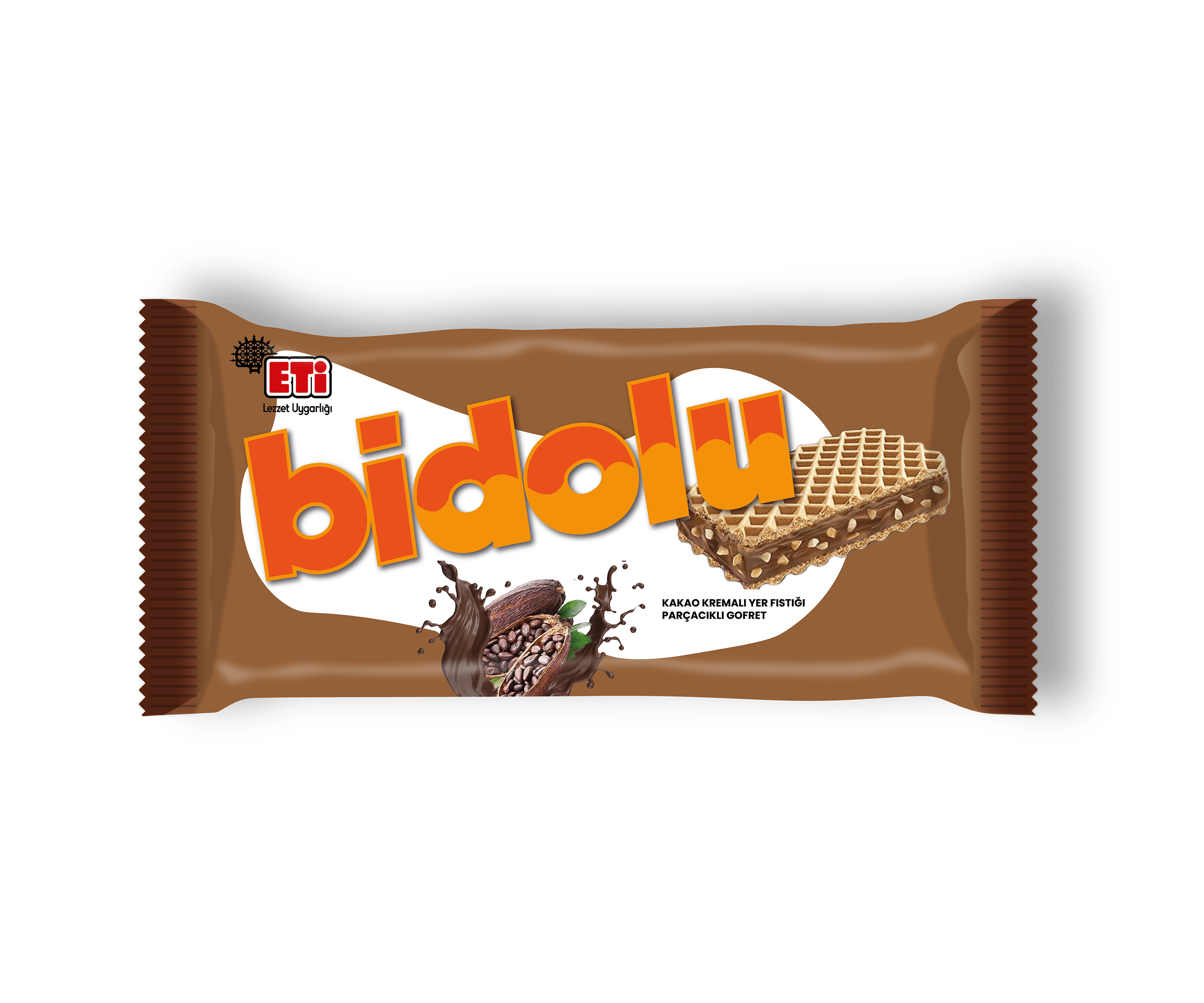
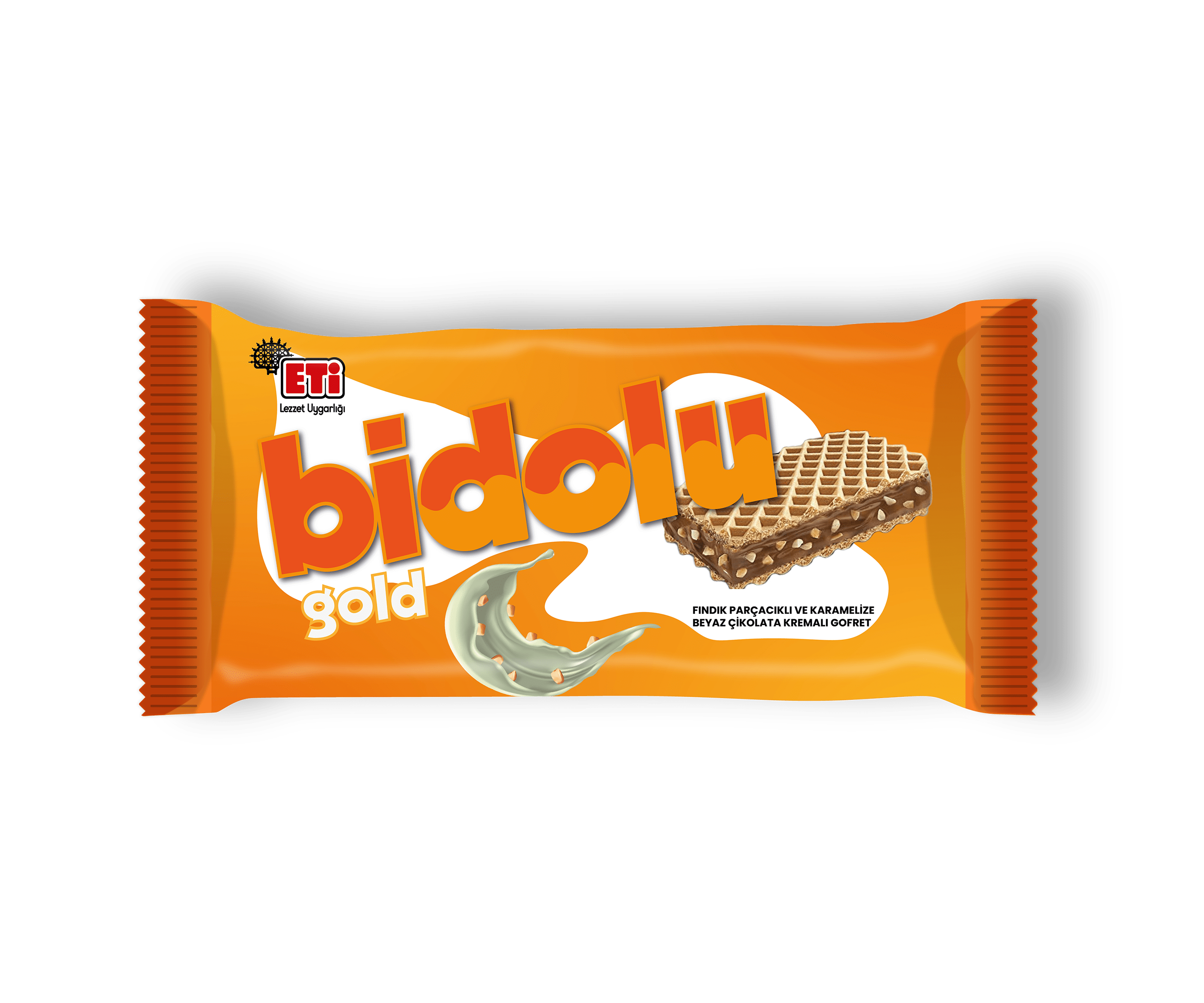
The redesign introduced a clear variant architecture across the Bidolu family. The classic recipe — hazelnut cream with peanut pieces — was given a bold red identity, energetic and confident on shelf. The cocoa cream variant with peanut pieces received a rich, deep brown treatment that feels indulgent without being heavy. And the newest addition to the family, the Gold edition, brought something entirely different: caramelized white chocolate cream with hazelnut pieces — a premium flavor that demanded its own visual language. Burnt orange, warm and distinctive, it stands apart while still belonging to the same family.
The fluid, wave-like forms rippling through the logotype are a direct reference to that sense of fullness — cream in motion, flavor that refuses to stay contained. The white organic blob framing the logotype and wafer photography creates immediate contrast against each variant’s saturated background. The “bidolu” logotype was scaled up dramatically, made playful and confident. The typography doesn’t just spell the name; it embodies it.
The Key Visual
ETİ BİDOLU
AİLESİNİN
YENİ LEZZETİ
AİLESİNİN
YENİ LEZZETİ
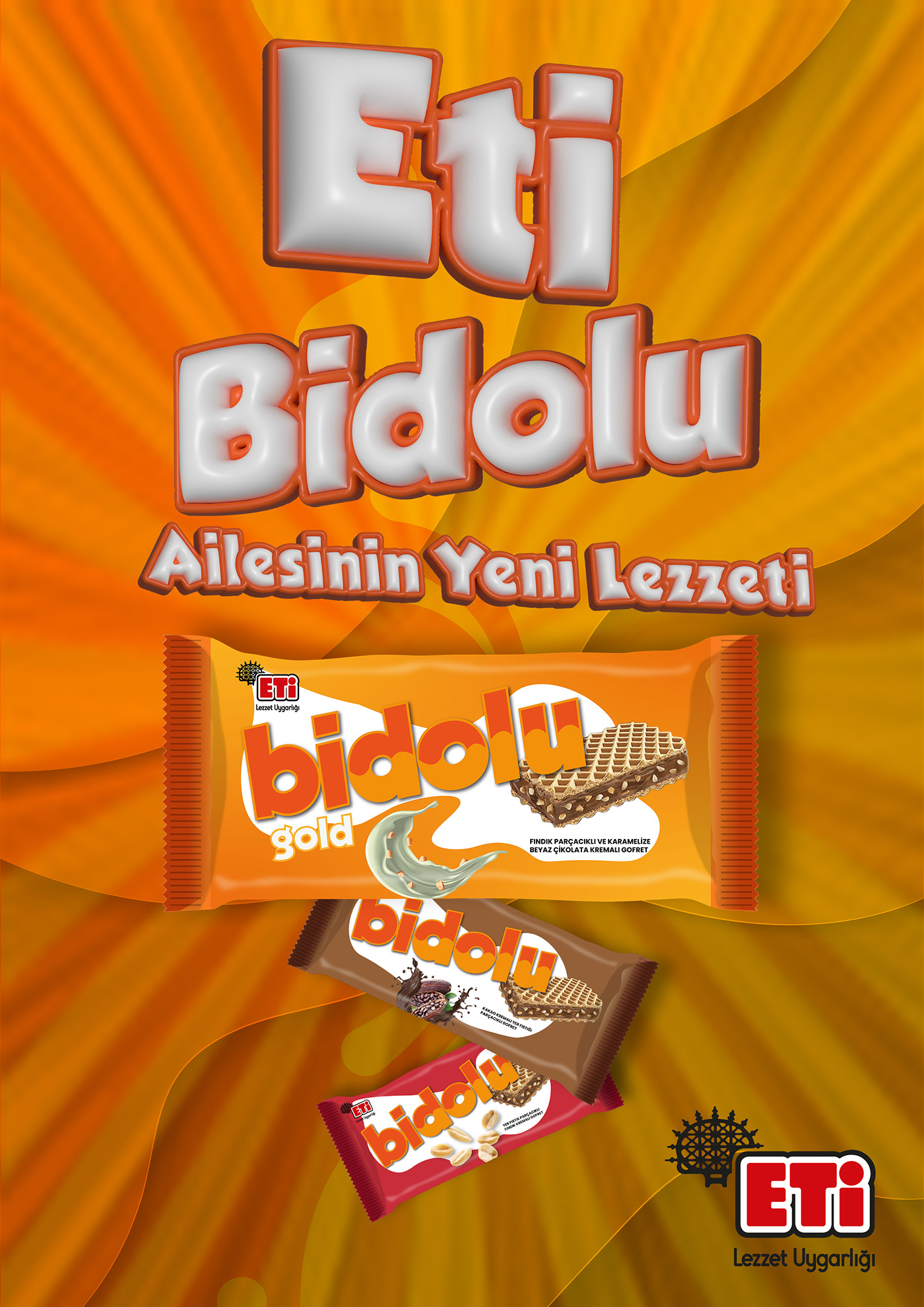
The campaign key visual was built around a single idea: abundance. A warm, sunburst orange background radiates energy behind all three Bidolu variants — Gold leading the composition in the foreground, flanked by the Cocoa and Classic editions cascading behind it.
The typography is fully three-dimensional — “Eti Bidolu” rendered in inflated, glossy white letterforms with a deep terracotta outline, commanding attention from the top of the frame. The tagline “Eti Bidolu Ailesinin Yeni Lezzeti” anchors the headline, introducing the new family of products with warmth and familiarity. The result is a poster that doesn’t just sell a wafer — it announces a new era for the brand.
Packaging Design
Key Visual
Brand Refresh
FMCG
Art Direction